Play it again, Sam

>> Monday, July 27, 2009

I had some spare time this weekend between work and obsessively checking Facebook status updates to procrastinate from working on my novel even more by creating another Lulu book. I had been wanting to check out the new minibooks they have been advertising like mad, and I haven't personally done any full-color printing through them. So it is definitely a bit of an experiment for me.

I used a short short story I wrote last winter or maybe early spring. If you read the Creative Writing Guild's publication, it was in the Origins issue. The story itself rests in a bit of a convoluted and slightly insane (perhaps?) space, so the imagery throughout (all copyright free old images found around the 'net) is a bit disjointed in turn. And who knows how it'll look after Lulu's printers get done with it.

One of the issues with Lulu's minibooks, right off the bat, is that you have no choice but to go through their little Photobook Creation Wizard. If by "wizard" they mean "program designed to frustrate and slow you down" they are correct. That is the only magic of this "feature." No Daniel Radcliffe or Selena Gomez in sight.
The back cover is set for you. A solid black field with a bright white Lulu logo. (All the other book choices allow you to remove the Lulu logo.) Then you move through each page, uploading images and doing the plug-and-play thing. There are a lot of "options" as far as page layout. Your picture can be centered with a border (either white or themed), full-page (which I did), two to a page, or half page with text on the other side. There's a strange greyish border around the edges, which I would assume to be crop marks, but they're wider on some sides than others and the gutter seems to be on the outside of the page versus the inside if it's following traditional page numbering. Which I hope it is. Because nothing tells you otherwise and it shows page 2 and 3 (for instance) as splash pages. I'm waiting to see the print version to find out what that is all about.
The other fun thing about Lulu's Wizard is the complete randomness of the program. If you have 5 images and they're all the same size and resolution, after you upload them and place them into the field, each one is going to be a different size and page orientation. There's no telling what causes this. Pics get cut off. They get reoriented. It's bizarre. And their nifty, in wizard editing options don't help a bit. You can "drag to reposition" but only so much and kind of only in an up and down motion. You can make the image larger, but never smaller. You can flip it or rotate it, which does help on occasion, but also changes the size and therefore hwo the image fits on the page. Who knows the logic behind this. I like to think that Lulu is secretly out to destroy the image distributing gene in all 15 year olds (which the onsite ads for the minibooks with their "share your Facebook pics" are definitely geared toward). Either that or they're hoping a stint with a brain teaser that incorporates webcam and cell phone photos of them and their friends will actually increase their problem solving skills and thus create a more tech savvy and adaptable generation whatever-the-fuck-they-are. I think we ran out of letters a while ago. I could be wrong though. About the generational label. I'm pretty sure I'm right about Lulu's intentions.

At any rate, I finished the book and ordered my copies. (Minibooks come in sets of 3 automatically which really makes the idea of "selling" such a work asinine as who in the general public would want to purchase three at a time?) They're postcard size which makes them easily distributable and carry-around-able. And three full-color, perfect bound, 22 page books were only $19. We'll see how they turn out.

In the meantime, here is a link to the thing on Lulu. Apparently, I can't set the photobook to be a download. (I did set the "preview" to be the entire book though.) And they completely lied on the "you can change this later" thing with the title. It won't let me. It just stays "My Photobook" to complete that "am I fifteen on Facebook or fifty and scrapbooking" feel.

So here's to trying new things.


Oh, and also: the new edition of Roast shipped today so I should have it soon. And my copies of Hymn are scheduled to arrive tomorrow. Exciting, exciting!

Read more...

Lulu book

>> Friday, July 24, 2009

For my Lulu book, I reworked an older book. The first book I did on Lulu, Roast had a lot of issues. I didn't know much about any of the Adobe programs. I wasn't really knowledgeable about the world of self publication. I just knew that I wanted to put out my work. I did everything in Microsoft Word. I used the formatting from Lulu's website combined with what I had read about "industry standards" on various websites. You know the ones. They're the sites with the random Googled GIFs on books opening and feather quills scrolling across the page. They have too many words and read as though the author spent so much time considering book formatting that they had no clue about actual web formatting. They're the ones you should really trust.
So, of course, I trusted them. I took their advice on spacing and page breaks and page numbering. I made my pdf.

It looked horrible. There was so much white space on the page. The font was gigantic. But, I figured, maybe something is lost on the screen. Perhaps, when my finished book makes its way from Massachusetts, it will be peachy keen and I will be a happy man.
It didn't work out. But, it wasn't so bad that I reeled. OK. So I reeled a little bit, but I was also overcome with the excitement of having a professionally perfect bound edition of my work, that I just approved it and wrote off the issues. I didn't know enough about any of the programs I could have used to fix it to worry much about it anyway.

Luckily, as it turns out, the size I chose for the book is no longer available for distribution with Lulu and I had the opportunity to go back in and correct the issues that arose with the first version. And so that's what I did.

Utilizing InDesign, I fixed the page layout. I changed the font. I fixed the kerning and the white space. I ensured that every "chapter" start - for this piece, actually every "new POV start" - began at the same place on the page. I changed the size from a 5x8 to a 6x9. It also dropped from a 109 page paperback of short stories to a 74 page paperback of short stories, lowering the price (since I am selling this one) to a much more reasonable price point.
I also changed my cover. Slightly. As I was going in anyway to change the size of the cover and the barcode to reflect the new price point, I used my brand new Photoshopping skills to chnage the text, add additional text to the back cover, and add text to the spine. Which - wapow! - I did correctly on the first try.

Here is a direct link to the new version.
I have it currently as "direct access" which allows you to pass out links for people to view or purchase it without having it available to everyone via Lulu's search engine. It's a good thing to do if you don't want to release it before the proof, but still want people - like this class perhaps - to be able to view it. The download on it is priced because I was already selling both versions, but since it's a direct link currently, I'll try to get back in there and change it to zero if people want to download a copy of the pdf. But it's a limited time offer. Once I approve the book for distribution again, I'll be pricing the download again. So act now!


As a bit of reference, here's a side by side comparison of the old versus the new:

Read more...

'Zine Distribution

>> Wednesday, July 22, 2009

In considering how to distribute Malform, I played around with a few options. One was to continue with my tried and true habit of placing them at work for folks to pick up. Kind of an easy out, and a coffee shop cliche, but what the hell. The other was mailing them to friends and family back home in Georgia. The third, and the one I decided to go with, leaves me with the remaining copies after our class exchange, still in my hands. For now.

I've got 10 copies of Hymn headed my way to sell around town. I figured I'd do the Quimby's thing with it, and perhaps try to get a copy or two into some other spots. I want to offer Malform up as a bonus with those copies. Or, perhaps, as a freebie at places where the book is sold to get folks interested in dropping the cash on the book. That way, the 'zine can act not only as a means of getting my stuff out there, but also as a form of guerrilla marketing. Not to mention, having an excerpt from the next novel I plan on releasing - if I ever get around to finishing it - helps to maintain an interest. Or at least I'd like to think it does.

As this plan leaves the 'zines in place for the moment, I have no pictures to post. So instead, I shall present a screen shot of my order from Lulu. It's still "fulfilling." But it should be coming soon.


Read more...

The Stuff of Legend

>> Tuesday, July 21, 2009

Anndell Quintero's La Peregrina: A New Myth for Panama (re)cast/(re)imagined/(re)created produces a sort of fancy reverence, a nostalgic longing, in it's reader. It is written keenly with an eye toward the informative, a glimpse into the mythos of what was, and a hand clasped firmly around the author's heritage and sense of humor. Even the cover, with it's slick bold font on velum over a map of Panama, presents a winking nod that the reader must return to once more. ["(re)cast" - the central story revolves around a pearl; "(re)created" - the pearl buys a man his freedom or "recreation." Okay, maybe I was pushing that one a bit.]
What works best about this 'zine is the state of limbo it places the reader in. In her introduction, Anndell writes of her practice as an author and an artist, of her need to present the stories of her memory in a means outside of convention, as a sort of bridge between the true story of what was and the imagined space of what it could be. As the tale of the "New Myth" begins (and finished out the 'zine), the reader is forced to choose between what is real and what is reimagined. Or perhaps "forced" is the wrong word. Perhaps it is more of a happy circumlocution, a wandering around through language and a reverence for memory that has not yet lost its sense of wonder or humor. Even the stern and bold black and white formatting, the lush deep tones of the text and photographs, and the "I-should-be-taken-seriously" map on the cover cannot hide the wonder prevelent within the anecdote, and only serve to push the dicotomic state of the 'zine further.
Anndell grounds her "New Myth" with photographs, many of which were taken by the author herself, and references to icons relatable in all cultures. She spans across lines of historical memory in a way that not only enriches the reader's desires to know more about the author and Panama, but also their own history and culture. Or at the very least, the means in which they interpret their own memories.

Read more...

MALFORM

>> Monday, July 20, 2009

Presenting Malform: brief tales and short stories about the oddity of the human condition.


Malform presents three (3) short stories -- "Still,"
"Bullet," and "Words Carved into Stone; Wood Left Unharmed" --
as well as an introduction to the forthcoming novel
Daredevil Amphibians.


To learn more or read excerpts from the 'zine, please visit the website.

Read more...

Prelude to 'Zine documentation

Whew. Whatta day. It was one of those days that never goes exactly as planned.
I left my cell phone at work on Sunday so I was flying blind and hoping he'd remember and be there when I set out for the train to my friend Atom's house in order to shoot photos for the Lulu book.
He wasn't there.
But he did show up, about twenty minutes later. So I did end up getting the photos.

I then took the train back down to my neighborhood and headed over to the Kinkos to get my 'zine printed up. It was the worst experience I've ever had at Kinkos. And for anyone who's ever had any experience at all with Kinkos, you know that's saying a lot. Their laptop stations were down, my flash drive was formatted for Mac and wouldn't work on any of their self-service PCs. I knew this because I'd tried it before, and yet the "helpers" there made me go from computer to computer (paying for the computer usage each time) to prove to them that it wouldn't work. It was strange. Then, they wouldn't print the files from my drive through their computers (which I've had them do before) because they can only help customers with "large format printing" or emailed jobs with a 24-hour turn-around.
So I left and headed downtown to school. I put cash on my artic card for the color printer and got everything printed out. But since the B&W printers don't do copies and I didn't want to pay .89 per page on the color copier, I headed out again and went to Kinkos on Jackson.
And then Kinkos got another big Fuck You from me as I went to create a booklet and discovered that Kinkos disables that option on their copiers. It's there. It pops up. But they've twerked their systems to not actually allow it. The guy who worked there couldn't even override it.
So I had to place two 8.5x11 pages in the correct order on the copier, make my 11x17s, then feed that through to make 2-sided prints. Not a big deal, just not as easy as the booklet making tool. Plus it wasted 8 sheets of paper.
After I got the interiors done, I went to do the color covers on the copier. I had decided that the centerfold of each one would also be a large poster of one of the cover illustrations also in full color, so I'd left my central splash page open to feed through the color copier as well. Then I discovered that Kinkos has raised their color copy price to 1.89 for 11x17 (which makes no sense next to the .49 for 8.5x11 - the price more than triples?) so I ended up doing the covers in color and the central splash in B&W.
I then decided to go ahead and use their radial cutter to trim the edges/margins off each of my print outs. It was dull, loose, and broken in parts. It wasn't smooth going at all, but it did a fair enough job. And I kind of enjoy the inconsistencies and jagged edges.

Then I noticed a typo.


Then, when I finally made it home (to my first meal of the day at 8pm) I got a letter in the mail informing me to report for Jury Duty on August 14th.

Good times. Heh.


This really was not intended to be a whoa is me post. More of a giant middle finger to Kinkos. And a reminder to myself that as appealing as their open 24 hour flourescent cube may be, it's really not worth the headache.

Read more...

Planning

>> Thursday, July 16, 2009

For 'zine #1, I decided to pull together a few short stories I'd previously written alongside the opening preface sort-of-thing for the novel I'm currently working on. So it'd kinda be like a little sample buffet of my writing, minus the sneeze guard.
I decided to use: Daredevil Amphibians: Preface; "Abbaiare A La Luna in Dm for Flute;" "Still;" "Harpen;" and "Words Carved Into Wood."
During our one on one workshopping during class, Jessica and Samantha helped me figure out some design factors. I decided to do the 'zine in the style of the Little Golden Books we can all remember reading as children.


I ran out after class to buy some supplies at Dick Blick:

I bought some pre-creased-for-easy-fold-and-probably-too-expensive-for-what-it-is cardstock in a sky blue, grass green, and cream. Sorry, I got no generic natural descriptor for the cream. Maybe "beach sand cream" could work.

I also sprang for the metallic gold drafting tape. Which is probably unneccesary, but I wanted it to emulate the gold foil from the Golden Books, and I figured it would it'd be a good way to cover up the staples.


After I walked out with my snazzy new book-making supplies (and picked up some new jeans next door) I sat on State Street for a few hours waiting for a friend of mine to come out of the casting call for Art Stars. I utilized the time to smoke way too many cigarettes and sketch out some ideas for the 'zine flow. You can see one of the sketches in the lower lefthand corner of the first photo.

Atom came out - finally - and I set plans for Monday to take photos of some of his artwork to use for my Lulu book. Bonus for getting a head start on the next one!

Once I made it home and really started going through the works, looking for images, and playing with the layout, I came to a conclusion. The design I had in mind from class and the design aesthetic I feel more drawn toward for this work are not condusive. So....

I decided to pull out "Abbaiare..." and stick in "Bullet." I'm going with an early 19th century illustration aesthetic for the 'zine. I also decided to use "Abbaiare..." and the Golden Books design (which really fits that story well) for Book#2. How's that for having the next three projects planned in advance?
The downside of this change in design is that I'm back to the drawing board on supplies for this particular 'zine. So, it's off to the Blick again tomorrow to figure out the cover color/stock for this one. Or maybe it's an upside. I love shopping for paper. Or office supplies in general, actually. Woohoo!

Read more...

Hymn

>> Wednesday, July 15, 2009

So, Hymn is officially for sale. Which is super exciting for me. I also pulled together a super makeshift webpage for it. But I'm proud of it because my skills in web development are minimal at best.
Here's a screen shot:
It's interactive to an extent and there's a few "eggs" in it, including the text to "Mongers" which I used for Chapbook #1.

There's also a link to purchase the book, if anyone is so inclined. Heh.
But as I mentioned before, the markup is ridiculous. I'm ordering some hard copies to sell at Little Branch and perhaps Quimby's and beyond. Because of my discount (or purchase at cost) and the bulk discount, I plan to sell them for a more reasonable price in hard copy. At least at first.

If anyone in class has any marketing or distribution tips, I'd love to hear 'em.

Cheers.


Read more...

Questions about software

>> Monday, July 13, 2009

Microsoft Word:
* How do you change the header/footer for each chapter? I've read the "help" and tried it to no avail. The main issue is, when working on formatting a book, ensuring that the first page of each chapter has no header or footer and that any blank pages within the text do not have them either. This never seems to work for me.

*How can you prevent MW from pushing text from the bottom of one page to the top of another? This often happens to hold a shorter paragraph together on the page, but results in a large amount of white space at the bottom of the previous page.

Illustrator/InDesign:
My knowledge in Illustrator and InDesign is so limited, any info will be fantastic. I'm sure questions will arise as I play with the software further.

Read more...

Distribution the First

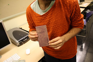
In distributing my first class chapbook, I definitely went the easy route. Nine of the fifteen were passed out in class. As evidenced here by cover model Ian:


I decided to present the remaining chapbooks for free at Little Branch Cafe, a coffee shop/bar in the South Loop. Here are a couple of photos:


While none moved Friday evening while I was at work - it was a slow night anyway - they were all gone when I came in for work on Saturday evening. A few were picked up by regular customers, but some were by new people. I'm interested in seeing what, if any, feedback I get when I see the people who picked them up again.

While it's nice to get them out so quickly and get them out to people I know and could possibly receive feedback from, I really want to ensure the next chapbooks move beyond the circle I've already been in. So while I will most likely post a few up at the coffee shop, I really want to investigate the ideas we posted in class further.

Read more...

Independent Publisher's Conference

>> Thursday, July 9, 2009

I received a postcard in the mail today about the 2009 Regional Publishing University - one of the many junk-mailish perks of putting out a book on Lulu - that I figured I would share here. It's being organized by the ibpa (Independent Book Publishers Association) and the Midwest Independent Publishers Association. It's expensive, but there could be some valuable information for anyone who has the cash and time to travel to it.

Regional Publishing University comes to the Twin Cities:
Everywhere we turn there are articles, stories, and presentations on the changing world of publishing. The Kindle, the digital revolution, people reading on their iPhones, Google Book Search -- what does it all mean for publishers and writers? Despite all the new technology, print books are still what people want to read. How can we produce the best books at the lowest cost? What's the best way to market those books using traditional techniques as well as today's technology?
Join experts at this year's Regional Publishing University, co-sponsored by the IBPA, formally PMA, and the MIPA. Lively discussions and presentations will include IBPA board members from Publisher's Weekly, Ingram, National Book Network (NBN) and others, as well as Midwest publishing industry leaders and entrepeneurs. There will be plenty of opportunities for one-on-one discussions and brainstorming ideas for the future.
Be a part of this dialogue on publishing matters because, well, publishing matters!

Who should come: publishers of all sizes, authors, writers who want to publish or be published, others in fields relating to publishing
Where: Embassy Suites Minneapolis Airport, Bloomington MN
When: August 14-15, 2009
Cost: Early registration deadline: Jusly 15. Friday only: $50 members, $60 non-members.
Saturday only: $125 members, $150 non-members. Friday and Saturday: $150 members, $175 non-members. After July 15, add $25.
Info: www.mipa.org or 651.917.0021
Do with this what ye will.

Read more...

gʹiliχon

>> Tuesday, July 7, 2009

Backstory:
I currently have two works that have been self-published. One, Roast, is a short story - or rather a collection of short stories as I tacked three shorter ones to the end - that I put out last year. The other, Hymn, is the first novel I've successfully completed, and is currently in the final stages of drafts and edits and approving and all the rest that goes into the final piece. Both were put out on Lulu.com.
Prior to these two works, I had used Lulu as a sort of a sounding board; viewing projects in various page sizes and formats, testing the waters on layouts, and utilizing the sleekness of the "perfect bound" binding option to amass final projects for a few classes.

Roast was originally written as an attempt to get back to short story writing, something I had moved away from while working consistently on Hymn. It also enabled me to free my mind from the onslaught of working on the longer piece for long enough to approach the novel with fresh eyes. The story itself evolves around three characters in a mid-Florida town, just outside of Orlando: Michael Mason (yeah, I have a thing for alliteration) who is working his first major case since making detective; Sarah Clarke, a slightly-off amusement park actress with a penchant for exotic foods; and Pippin Parson, a mad-at-the-world amusement park actress with achondroplasia.

Excerpt:

Detective Michael Mason

So I’m waiting in line at the supermarket at three in the morning. It’s that time when they don’t want to actually pay people to man the store so they only got those self-checkout things open. And at three am, no matter how few people there are in the store stocking up on microwave dinners and pints of ice cream, no matter how few people there are in the store, there’s always a long fucking line at those self-checkouts. Because everyone is too goddamn lazy to go to them during the day when they got clerks in green smocks staring off into space as they bag your groceries. Everyone is too goddamn lazy to use these things unless they have to so no one knows how to fucking use them when they have to.
And the whole time I’m waiting in line, the whole time I’m waiting and wiping my hand on my pants to get the sticky from the dripping pint of pistachio ice cream I’m holding, the whole entire time I’m looking at these people. I’m wondering if any of them are my perp. If that lady with the family-sized pack of Twinkies is loading up little kids from the soccer game and jack-knifing their teeth out. If that weasel-y looking guy, the guy with the greasy black hair that’s thinning so much the comb over looks more like a street map on his scalp, the guy with the wiry facial hair that can’t really decide on a growth pattern, the only employee here this late at night, if he decided his power as the security for the graveyard shift was going unnoticed and decided to take it out on all the kids he could lure with pistachio ice cream. The ice cream that’s coating my hands.
And this guy is nodding at me like the badge clipped to my waste and the bubblegum machine tin star he’s got pinned to his green smock, like the two of them bond the two of us in some sort of camaraderie.
And that lady at the front of the line still can’t figure out how to bag her Twinkies. Where the hell to swipe her credit card.

My phone rings and I know it’s my wife wondering what time I’m going to get home. Except it’s not my wife. It’s Miles down at the station. It’s Miles telling me he knows I just got off shift but I may want to come back in. Telling me there’s something at the campgrounds off the Four-oh-Eight I might be interested in seeing.

A Good Samaritan would put the ice cream back in the cooler. A good customer would do that. I toss the pint on top of the store brand soda display and head toward the automatic doors.
I wonder if Twinkie lady could figure out a fucking door handle if the motion sensor didn’t alakazaam her out of the store in a whir of radiation.
I wonder if my bitch ass child-molesting murderer works cleaning detail here in his spare time. If he’ll have to wipe up crusty green ice cream from stacks of strawberry and orange flavored pop.

What I learned:
Publishing Roast taught me a lot - mostly about patience. I wanted to get something out there so badly, I overlooked quite a bit. Typos permeate the text. All the rules I read online about self-publishing formatting were pretty much skewed to the point of absurdity. I worked solely in Microsoft Word and that brought about its own limitations in form and layout.
But I was so excited! I'd bought my ISBN and everything!

In the end, I'm not unhappy with the book, but I'm not exactly pleased with it either. In my rush to approve the draft and get the piece into production, I didn't spend as much time going through it as I should have. I didn't have other people go through it for mistakes I may have missed. It's easy to get too close to a piece and that definitely happened with this one.
Also, as it turns out, the sizing I chose for the book is no longer available for outside-of-Lulu distribution, so I get a second chance at it. In reformatting the book size, I will be going back in to fix errors and really get a feel for laying out the book as a whole. I won't be relying on what I've read from websites about kerning and fonts and space between the lines. In the end, what I took from this experience, is that rules are there for a reason, but once you understand them, it's okay to break them to create something you find visually exciting and interesting. A lot of times, this is just as important as the writing itself.


Hymn:

Hymn has been a much slowly process for me. Almost excruciatingly so. I began writing the text for the novel before I began school here at SAIC. I went through several titles. I played with varying formats. Even as I was working on the actual manuscript, I utilized my time in considering the finished package for the project. While this did not necessarily influence the writing of the piece, it really enabled the piece to influence the printed form. I chose a font that isn't really recommended for novels because it related to the story. I played around with chapter starts. I went through hundreds of cover designs before settling on the final version, and even now have just finalized the back cover and inside flaps. I really paid attention to breaking convention where it was appropriate and keeping it intact where it helped with flow - where it helped with retaining ease of readability.
I guess for this one, I took what I learned from Roast and really applied it. I produced a "junk" draft first, one that I knew I could mark up and really play with. I let this serve as a playground for dealing with layout as well as a printed copy to really go in and edit. Even though I mostly write on my laptop now, I still find it much easier to edit on the page - unfortunately for the trees. From this draft came two others in which I pushed boundaries with layout. My final draft, which is arriving in the mail soon, is a bit more subdued in its boundary pushing, but overall, it is the one I'm happiest with. I'm sure it'll drive me crazy in a month or two, but that's what the paperback edition is for, right?

You can read an excerpt of Hymn by clicking on the cover photo to the right, so I won't place it here.

Bringing it on back - or at least to class:
While Hymn has currently got the hatchet, I'm looking forward to utilizing what I learn in class to help reformat Roast. Mostly though, I am really looking toward producing new work for this course, either in the form of shorter complete works or excerpts and fragments from the two novels I'm currently working on (Taste and Daredevil Amphibians). I'm also looking forward to learning the programs so I can really help the design aspects of these works pop. I can see it all so clearly in my head, but completely lack the technical skill to pull it off.
It will also be great to move outside of the POD world some and actually get some hands-on experience with the making.

Read more...

About This Blog

Lorem Ipsum